Youden plots

The Youden plot is a graphical method to analyse inter-laboratory data where the samples are ordered in pairs with similar concentrations. One plot is made for each pair of samples and gives results for all participating laboratories. The plots visualize both systematic and random errors.

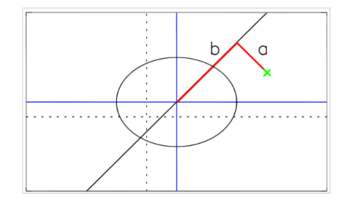
The plot is drawn as a scatter plot where each point represents a pair of concentrations for one laboratory. The expected values for the two samples are drawn as solid blue lines. The median of the measured values excluding outliers is drawn as dotted lines. The solid lines divide the plot in four quadrants.

If errors are due to random factors, the points will be evenly distributed around the mean value and situated in all four quadrants.

If systematic errors dominate, the results will be close to a 45° reference line, and be situated in the upper right quadrant (overestimation) or lower left quadrant (underestimation).

Drawing a line from a given point perpendicular on the 45° reference line gives two line segments, one from the point to the intercept on the reference line (a), and one continuing from the intercept to the point representing the expected values (b). The lengths of these line segments are measures of the random and systematic errors respectively.

Ellipses with radii corresponding to the data quality objectives (DQO) are added in each plot. The data points are colour coded depending on the magnitude of errors.

Components Radii
SO2 in abs.sol, NO2 in abs.sol. 10%
SO2, HNO3 and NH3 in impregnated filter 20%
SO4, NO3 10% accuracy or better
NH4, Cl, Ca, K, Mg, Na, cond, H+ (from pH)  15% accuracy or better
pH 0.1 units
Pb, Ni, Cr, As, Cd, Zn, Cu 15% accuracy or better (high concentrations)
Pb, Ni, Cr, As, Cd, Zn, Cu 25% accuracy or better (low concentrations)
Error criteria Colour
Within 0.5*DQO Blue
Within DQO Green
Within 2*DQO Orange
> 2*DQO Red


Last updated: February 2013 by Anne Hjellbrekke